Time series
There is a wide and extesive documentation about Pandas library and time data. The web is plenty of pages with examples and recipes, Google for them. A short overview here, a nice article from Python Data Science Handbook here.
Let's try with 2 pratical examples:
- Water level measurements of a river
- COVID-19 data
Example 1 - water level measurements
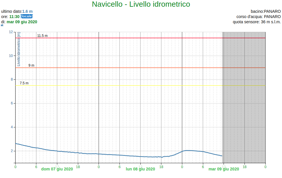
A csv file contains water level measurements of a river (data from ArpaER - livello idrometrico, download here).
Arpae-SIMC

Navicello
Inizio validità (UTC),Fine validità (UTC),Livello idrometrico (M)
2019-06-08 22:00:00+00:00,2019-06-08 22:00:00+00:00,1.25
2019-06-08 22:15:00+00:00,2019-06-08 22:15:00+00:00,
2019-06-08 22:30:00+00:00,2019-06-08 22:30:00+00:00,1.26
2019-06-08 22:45:00+00:00,2019-06-08 22:45:00+00:00,
2019-06-08 23:00:00+00:00,2019-06-08 23:00:00+00:00,1.25
2019-06-08 23:15:00+00:00,2019-06-08 23:15:00+00:00,
...
File inspection: note the header, the footer and missing values. The read_csv function can handle them:
import numpy as np
import pandas as pd
import matplotlib.pyplot as plt
df = pd.read_csv('fiume1.csv', skiprows=3, skipfooter=9, engine='python').dropna()
df
Renaming columns and reindexing with the to_datetime() function (details here):
df.columns = ['start', 'stop', 'lev']
df.set_index(pd.to_datetime(df.stop), inplace=True)
Drop columns
df = df.iloc[:,-1]
df
df.plot()
plt.show()
df['2019-12'].plot()
df['2019-09':'2019-11'].plot()
df['2019-11'].plot()
df['2019-11'].shift(1, freq='D').plot()
The resample() function (details here)
weekmax = df.resample('1w').max()
weekmax.plot()
weekmax = df.resample('1w').max()
weekmin = df.resample('1w').min()
weekave = df.resample('1w').mean()
plt.plot(weekmax, label='max')
plt.plot(weekmin, label='min')
plt.plot(weekave, label='average')
plt.legend()
plt.show()
Let's create a function to read data from different files
def readdata(file='fiume2.csv') :
    df2 = pd.read_csv(file, skiprows=3, skipfooter=9, engine='python').dropna()
    df2.columns = ['start', 'stop', 'lev']
    df2.set_index(pd.to_datetime(df2.stop), inplace=True)
    df2 = df2.iloc[:,-1]
    return df2
Suggested/proposed analysis
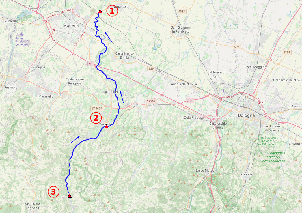
The 3 files fiume[1,2,3].csv contains readings from hydrometers in 3 different points (from upstream to downstream: 3, 2, 1). Interdistances are:
- point3 - point2 = 17.7 km
- point3 - point1 = 48.0 km
Is it possible to measure the river high level(s) moving speed along the path?
riv1 = readdata('fiume1.csv')
riv2 = readdata('fiume2.csv')
riv3 = readdata('fiume3.csv')
riv1['2019-11-03':'2019-11-6'].plot(color='blue', label='point 1')
riv2['2019-11-03':'2019-11-6'].plot(color='red', label='point 2')
riv3['2019-11-03':'2019-11-6'].plot(color='orange', label='point 3')
plt.legend()
plt.show()
riv1['2019-11-03':'2019-11-6'].plot(color='blue', label='point 1')
(riv2['2019-11-03':'2019-11-6']*4+2).shift(5, freq='h').plot(color='red', label='point 2')
(riv3['2019-11-03':'2019-11-6']*4+3).shift(6, freq='h').plot(color='orange', label='point 3')
plt.legend()
plt.show()
Example 2 - COVID19 data
Dataframes can be also created from csv files uploaded on the web.
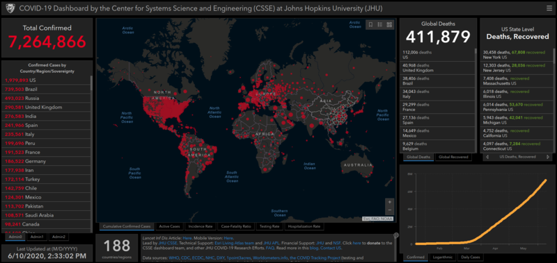
As far as COVID19 data are concerned, you may have already encountered this page COVID-19 Dashboard by the Center for Systems Science and Engineering (CSSE) at Johns Hopkins University (JHU)
Browsing the link at the bottom of the page lead to their github page and thus to the updated data sources: JHU CSSE Github repository.
source_confirmed = 'https://raw.githubusercontent.com/CSSEGISandData/COVID-19/master/csse_covid_19_data/csse_covid_19_time_series/time_series_covid19_confirmed_global.csv'
source_deaths = 'https://raw.githubusercontent.com/CSSEGISandData/COVID-19/master/csse_covid_19_data/csse_covid_19_time_series/time_series_covid19_deaths_global.csv'
source_recovered = 'https://raw.githubusercontent.com/CSSEGISandData/COVID-19/master/csse_covid_19_data/csse_covid_19_time_series/time_series_covid19_recovered_global.csv'
If in interested in detailed italian data, visit Presidenza del Consiglio dei Ministri - Dipartimento della Protezione Civile
source_italy_detail = 'https://raw.githubusercontent.com/pcm-dpc/COVID-19/master/dati-andamento-nazionale/dpc-covid19-ita-andamento-nazionale.csv'
source_italy_prov = 'https://raw.githubusercontent.com/pcm-dpc/COVID-19/master/dati-province/dpc-covid19-ita-province.csv'
Wolrd data
Let's inspect the worldwide data content:
# dataframe creation
data = pd.read_csv(source_confirmed)

# first values
data.head()
Data are arranged 1 line per nation (more or less), Lat and Long columns, and several time columns (1 per day).
data['Country/Region'].value_counts()
data['Country/Region']=='France'
data[data['Country/Region']=='France']
If we want to isolate mainland France data, the easiest way is by iloc[...]:
data.iloc[116,:] # <-- that means: line nr 116, all the columns
Let's extract the time series for Italy:
filt = data['Country/Region']=='Italy'
data[filt]
Using iloc to strip non necessary data:
ita = data[filt].iloc[0,4:]
Create a datatime object using to_datetime():
ita = pd.Series(ita, index = pd.to_datetime(ita.index))
Add deaths and recovered
def getitalyseries(source) :
    data = pd.read_csv(source)
    s = data[data['Country/Region']=='Italy'].iloc[0,4:]
    s = pd.Series(s, index = pd.to_datetime(s.index))
    return s

ita_c = getitalyseries(source_confirmed)
ita_d = getitalyseries(source_deaths)
ita_r = getitalyseries(source_recovered)
ita_c.plot(color='orange', label='confirmed')
ita_d.plot(color='red', label='deaths')
ita_r.plot(color='green', label='recovered')
plt.legend()
plt.show()
Day by day?
itadelta_c = pd.Series(np.diff(ita_c), index = ita_c.index[1:])
itadelta_c.plot(color='orange', label='confirmed delta')
Compare with Brazil?
bra = pd.read_csv(source_confirmed).iloc[28,4:]
bra = pd.Series(bra, index = pd.to_datetime(bra.index))
bradelta = pd.Series(np.diff(bra), index = bra.index[1:])
itadelta_c.plot(color='orange', label='Italy')
bradelta.plot(color='blue', label='Brazil')
plt.title('Confirmed cases per day')
plt.show()
Italy
df = pd.read_csv(source_italy_detail)
df
df.set_index(pd.to_datetime(df['data']), inplace=True)
for i,c in enumerate(df.columns):
    print(i,c)
df.iloc[:,[2,3,4,6,10]].plot()
df = pd.read_csv(source_italy_prov)
df.set_index(pd.to_datetime(df['data']), inplace=True)


como = df[df['denominazione_provincia']=='Como']
varese = df[df['denominazione_provincia']=='Varese']
bergamo = df[df['denominazione_provincia']=='Bergamo']
como.totale_casi.plot(label='Como')
varese.totale_casi.plot(label='Varese')
bergamo.totale_casi.plot(label='Bergamo')

plt.legend()
plt.show()
Suggested/proposed analysis
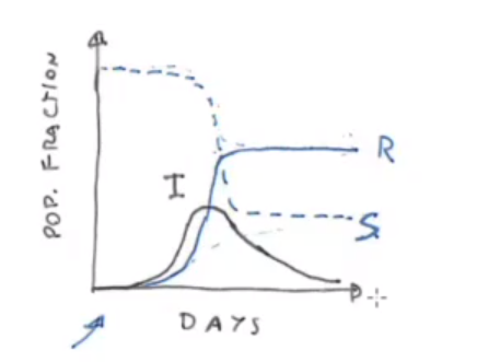
- Try to implement SIR and SIRD models (Susceptible - Infected - Recovered [- Deaths]) using differential equations and make some basic comparison with the data from a bunch of nations at your choice.
RESOURCES: on April 1st, 2020 Prof. F. Ginelli gave a seminar on modeling strategies for the COVID-19 epidemy. Video: Semplici strategie di modellizzazione dell'epidemia COVID-19
In the seminar the SIR and SIRD models and their parametrization are introduced.
Compare different nations normalizing to the population and offsetting the starting dates.
Use the geografic data provided in the PDC-DPC Github repo (shape files) and the GeoPandas library to create a geographical representation of the epidemic in Italy.